As we already know, MailChimp is one of the main email marketing tools used by freelancers, SMEs or large companies around the world, and one of the features that has made this success possible is, probably, the ease with which templates can be created in MailChimp to be reused in different campaigns later.
Templates vs MailChimp campaigns
First, let’s differentiate template from campaign template, because sometimes we tend to confuse them:
- A template or MailChimp template is a predefined email design that we use to later create our campaigns. Templates are not sent; they are saved and serve as a base template to prepare different campaigns.
- A campaign is the email you send to your database after selecting a template that has already been created and after modifying the defined content blocks with the necessary texts and/or images.
Templates in MailChimp
A template is a pre-structured or prefabricated email template where content can be managed. MailChimp offers its users different template options, so we have several alternatives when creating our own templates.
MailChimp templates have a modular model, which allows us to edit them quickly and easily by dragging and dropping modules (drag&drop) from the editing tool. In addition, all the templates it offers us are optimized for correct viewing on all devices: desktop, tablet and mobile.
- We can choose a template already defined by MailChimp and save it within our templates to use that same structure, either from the schematic options they give us, or from the options they provide us with examples of use of text and image blocks.
- We can create our own template by choosing one of the predefined ones and modifying it according to our needs, adding, deleting or modifying the existing content modules.
- If we have created our own HTML template outside of MailChimp, the tool also allows us to upload it to the system for use, either by copying and pasting the code, or by uploading the HTML (in which case, the URLs of the images in the code must be in absolute paths), or by attaching a zip file with all the material. We must bear in mind that, if we use this option, the only way to edit and modify our template will be by editing the HTML code, we will not be able to include drag&drop modules from MailChimp or use the Wysiwyg editing available when we create templates through the MailChimp creator.
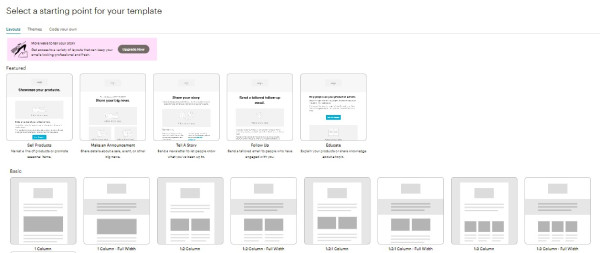
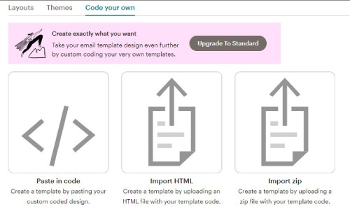
Note: Depending on the type of plan we have contracted in MailChimp, we will have different template options available.
We show you a basic example of how to select and create a template from the Classic MailChimp Generator:
{% video_player “embed_player” overrideable=False, type=’hsvideo2′, hide_playlist=True, viral_sharing=False, embed_button=False, autoplay=False, hidden_controls=False, loop=False, muted=False, full_width=False, width=’1366′, height=’728′, player_id=’122935277211′, style=” %}
13 Design Tips for Creating Our Templates
We leave you some design recommendations to consider when preparing our templates in MailChimp:
- The width of the MailChimp templates is 600 px. Size optimized for correct viewing.
- If we are going to use an image that occupies the full width of the template, for example, as a header image, the tool recommends that it has a maximum width size of 564 px.
- If we use column blocks in our content, we must consider the recommended sizes for the images in each case: 264 px. wide for 2 columns and 164 px. wide for 3 columns.
- The format of the images to be used must always be PNG, JPG or GIF. In case of using images with a transparent background, the format must be PNG.
- The size of the image files should not exceed 1MB for large images. It is recommended that they are optimized at 72 dpi and that they are uploaded to the tool with the size that they are going to be used in the template.
- Do not use spaces or special characters in the name of the images, this can cause some type of error to display the image.
- Take care of the proportion of image and text in our template. Whenever possible, we will include more information in text than in image, it is true that a text with design or included in an image can be more attractive. Several email servers use spam filters based on the proportion of image and text in each email, if there is too much image, they will consider it spam and it will never reach our recipient. In addition, some users have the option of automatic image download disabled and when seeing an email completely blank, they can delete it directly. It is recommended to maintain a proportion of 60% text and 40% image, considering the ideal 80% text and 20% image.
- Try not to use more than 3 images in a template.
- Pay attention to the sizes of the different texts, the size for the body of the message should be between 14 and 16 px. For headers we will use a text between 18 and 22 px.
- We will use one of the standard web design fonts (Arial, Verdana, Helvetica, Courier, Georgia, Lucida Sans, Tahoma, Times New Roman or Trebuchet MS) for the text, otherwise, there could be problems displaying the text in the mail client.
- Equally important is both the color and the size of the CTA buttons in the email. Use striking colors like orange or red and, as for size, ideally, they should go between 44 px. and 48 px.
- We will use the corporate color palette.
- When creating the template, we must correctly structure the information and logically, using separators between content blocks. We will use short paragraphs of text, including a main idea per paragraph.
Once we have created our template following the chosen scheme, we simply must save it to be able to reuse it in our future mailings. Just select it when including the design in a campaign and edit its content with the new texts and images.
Creating a template for each of the different types of shipments that we make recurrently from MailChimp can save us time and resources. Its editor is very easy to use, and we can trust that the deliverability of the campaign is optimal in relation to the design.


